United Way
Print Design - Branding
United Way South Dakota
Client Goal
Report annual financials in a way that engages donors and clearly communicates local impact of the programs.
Key Deliverables
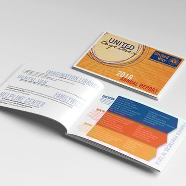
Printed annual report booklets
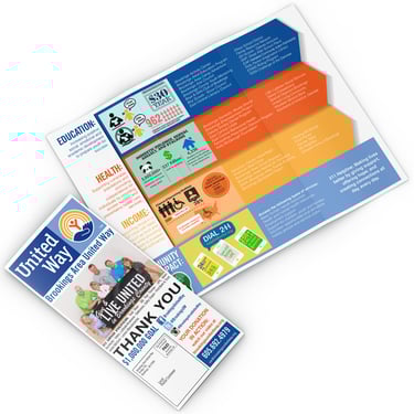
Printed mailer brochures
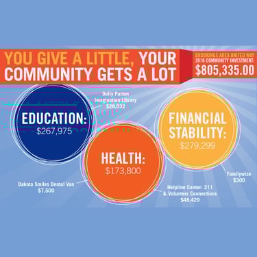
Infographics
Logos
Challenge
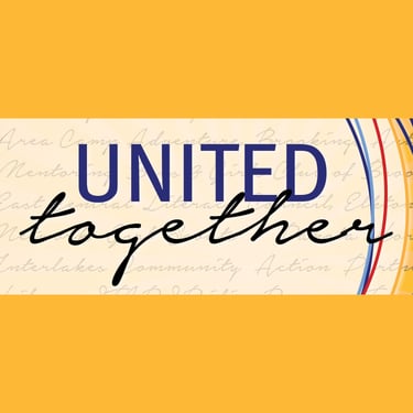
The client needed a distinct yet cohesive logo for their year-end reports that aligned with their national brand while maintaining a unique identity. Balancing brand consistency with individuality required a thoughtful design approach. Additionally, the infographics had to transform complex financial data into an engaging visual story that quickly communicated the impact of donations. The tri-fold mailer presented another challenge—condensing financial results, impact summaries, and a donation appeal into a clear, visually compelling, and easily digestible format for donors.
Approach
I carefully studied United Way’s national identity, leveraging complementary colors, typography, and visual elements while introducing a distinct mark for their reports. For the infographics, I focused on a clean, intuitive design that simplified financial data into compelling visuals, using charts, and bold statistics to highlight community impact at a glance. The tri-fold mailer was strategically structured to balance storytelling with clear calls to action, guiding the reader from impact insights to a seamless donation request.
Results
Designed a cohesive yet distinct logo that maintained brand integrity while differentiating the year-end reports
Created engaging infographics that transformed complex financial data into an easily digestible and impactful visual narrative.
Developed a tri-fold mailer that effectively communicated financial outcomes and encouraged next year contributions.
Strengthened donor engagement through strategic visual storytelling, improving clarity and impact.
Delivered a polished, professional design package that aligned with United Way’s mission and branding goals.